
This is an exploration of typographic form. I examined seven classic fonts that have emerged throughout the development of typography and represent distinct phases in it's history. My objective was to focus on pure shape, taking away as much context as possible from the font and create small little "bits" of type that exist as their own form. I then took "bits" from the seven font explorations and created one cohesive design that established visual hierarchy.
Once the exploration of each font was complete, I picked seven of the "bits", one from each font, and created a stand-alone composition. Still trying to keep as much context out of the font shapes and focus primarily on form and movement.
Below is a snapshot of my process, how I went from focusing on individual fonts to bringing multiple fonts together into one design. I explored a few different compositions before landing on my final design as well as exploring the design in color.


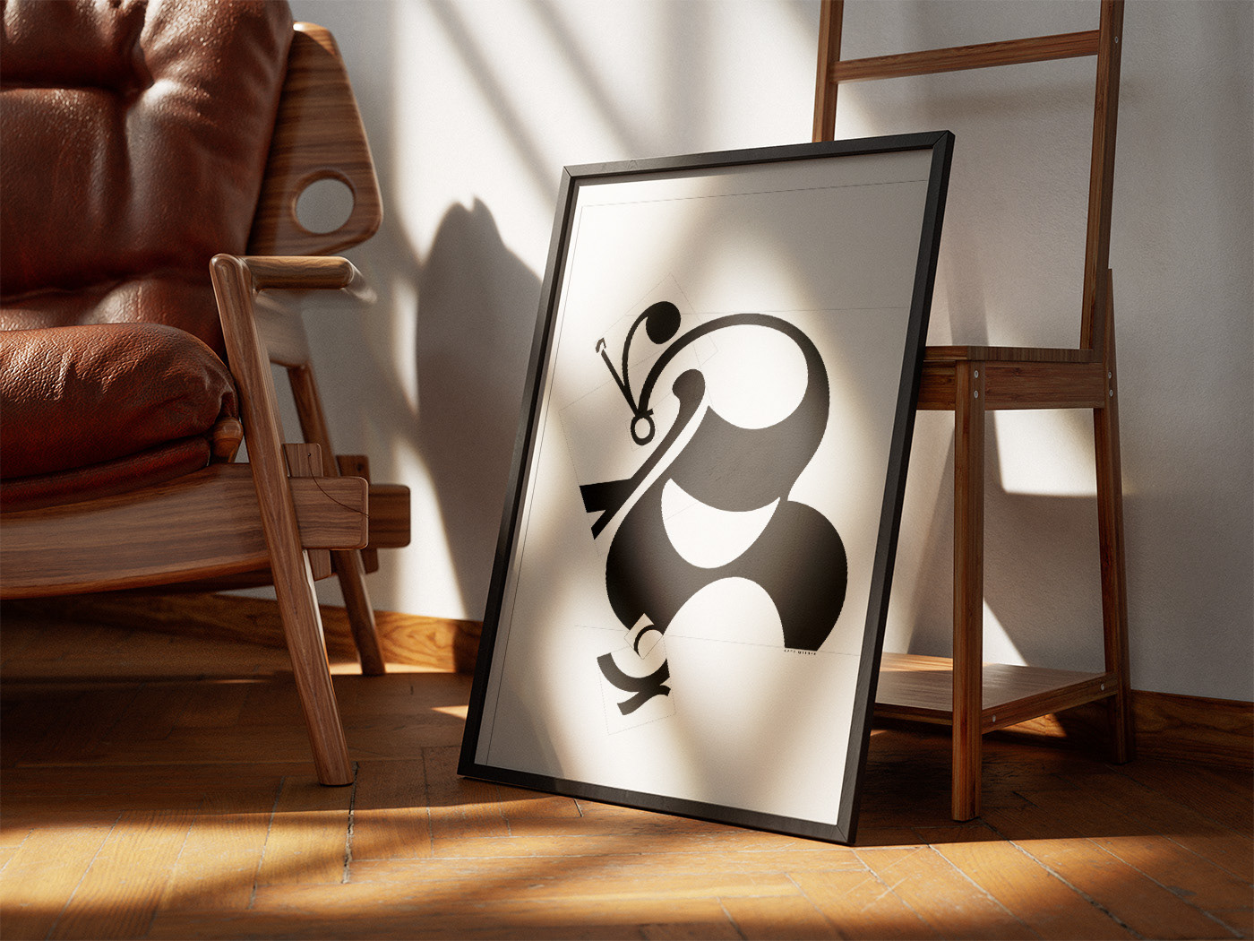
This mock up of my design was to get an idea of how it would transfer to large scale. I wanted to create a design that could function in both small and large scale renderings.

